더보기
17일 차 회고.
토이 프로젝트를 다른 팀과 연관되는 부분이 있어서 합치기로 결정했다. 이에 대한 회의를 수업이 끝난 후에 남아서 하기로 했는데 병원에 가야해서 참여를 하지 못했다. 현재 운동도 쉬고 있는데 몸이 다 나으면 다시 운동을 시작할 예정이다.
1. Data Visualization
1-1. Matplotlib
축 제목 추가
plt.plot(np.arange(2, 7))

plt.xlabel("X축 제목")
plt.ylabel("Y축 제목")

plt.show()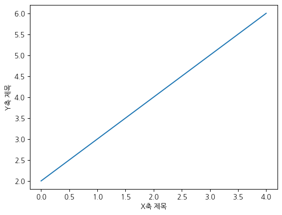
fig, ax = plt.subplots(1, 2, figsize=[15, 10])

x = range(0, 10)
y = np.exp(x)

ax[0].set_title("Exponential Function",)
ax[0].plot(x, y)
ax[0].set_xlabel("X축")
ax[0].set_ylabel("Y축", rotation=0, labelpad=20)

x = range(1, 1000)
y = np.log(x)

ax[1].set_title("Logarithmic Function")
ax[1].plot(x, y)
ax[1].set_xlabel("X축")
ax[1].set_ylabel("Y축", rotation=0, labelpad=20)

plt.show()
눈금 추가하기
fig, ax = plt.subplots(1, 2, figsize=[15, 10])

x = range(0, 10)
y = np.exp(x)

ax[0].set_title("Exponential Function",)
ax[0].plot(x, y)
ax[0].set_xlabel("X-axis")
ax[0].set_ylabel("Y-axis", rotation=0, labelpad=20)
ax[0].set_xticks(range(1, 10, 2))

x = range(1, 1000)
y = np.log(x)

ax[1].set_title("Logarithmic Function")
ax[1].plot(x, y)
ax[1].set_xlabel("X-axis")
ax[1].set_ylabel("Y-axis", rotation=0, labelpad=20)
ax[1].tick_params(axis='x', labelrotation=45)
ax[1].set_yticks(range(0, 8))

plt.show()
스타일 지정하기
fig, ax = plt.subplots(1, 2, figsize=[15, 10])

x = range(0, 10)
y = np.exp(x)

ax[0].set_title("Exponential Function",)
ax[0].plot(x, y, marker='o', color='r')
ax[0].set_xlabel("X-axis")
ax[0].set_ylabel("Y-axis", rotation=0, labelpad=20)
ax[0].set_xticks(range(1, 10, 2))

x = range(1, 1000)
y = np.log(x)

ax[1].set_title("Logarithmic Function")
ax[1].plot(x, y, linestyle="--", color='g')
ax[1].set_xlabel("X-axis")
ax[1].set_ylabel("Y-axis", rotation=0, labelpad=20)
ax[1].tick_params(axis='x', labelrotation=45)
ax[1].set_yticks(range(0, 8))

plt.show()
범례 추가하기
fig, ax = plt.subplots()

x = np.arange(10)
ax.plot(x, color='b')
ax.plot(x**2, alpha=0.5, color='r')

ax.legend(["x", "x^2"])

plt.show()
선 그래프
x = np.arange(0, 4, 0.5)

plt.plot(x, x+1, 'bo')
plt.plot(x, x**2 - 4, 'g--')
plt.plot(x, -2 * x + 3, 'r:')

plt.axvline(1.0, 0.2, 0.8, color='lightgray', linestyle='--', linewidth=2)
plt.axhline(4.0, 0.1, 0.9, color='darkgray', linestyle=':', linewidth=5)

plt.show()
막대 그래프
막대 그래프는 범주형 데이터를 비교할 때 사용한다.
x = np.arange(3)
years = ['2018', '2019', '2020']
values = [100, 400, 900]
colors = ['r', 'y', 'g']

plt.bar(x, values, color=colors, width=0.5)
plt.xticks(x, years)  # x축 값

plt.show()
x = np.arange(3)
years = ['2018', '2019', '2020']
values = [100, 400, 900]
colors = ['r', 'y', 'g']

plt.barh(x, values, color=colors)
plt.xticks(x, years)  # x축 값

plt.show()
산점도 그래프
n = 50
x = np.random.randn(n)
y = np.random.randn(n)

area = (30 * np.random.rand(n)) ** 2
color = np.random.rand(n)

plt.scatter(x, y, s=area, c=color, alpha=0.5, cmap='Spectral')
plt.colorbar()

plt.show()
히스토그램
히스토그램은 연속형 데이터의 분포를 나타낼 때 사용한다.
weight = [68, 81, 64, 56, 78, 74, 61, 77, 66, 68, 59,
          71, 80, 59, 67, 81, 69, 73, 69, 74, 70, 65]

plt.hist(weight)
plt.show()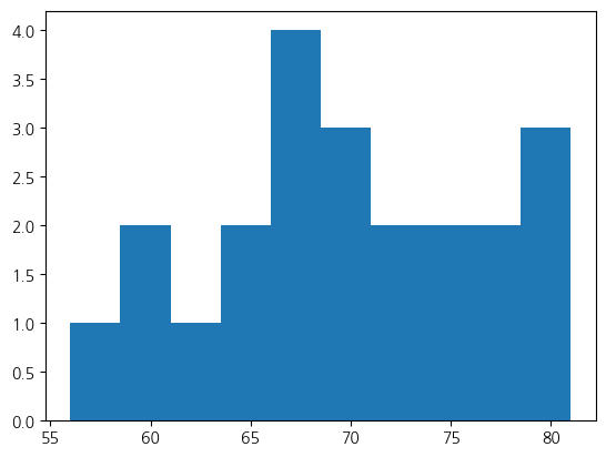
weight = [68, 81, 64, 56, 78, 74, 61, 77, 66, 68, 59, 71,
        80, 59, 67, 81, 69, 73, 69, 74, 70, 65]
weight2 = [52, 67, 84, 66, 58, 78, 71, 57, 76, 62, 51, 79,
        69, 64, 76, 57, 63, 53, 79, 64, 50, 61]

fig, ax = plt.subplots(2,2,figsize=(15,10))

ax[0,0].hist((weight, weight2), histtype='bar')
ax[0,0].set_title('histtype - bar')

ax[0,1].hist((weight, weight2), histtype='barstacked')
ax[0,1].set_title('histtype - barstacked')

ax[1,0].hist((weight, weight2), histtype='step')
ax[1,0].set_title('histtype - step')

ax[1,1].hist((weight, weight2), histtype='stepfilled')
ax[1,1].set_title('histtype - stepfilled')

plt.show()
오차막대 그래프
x = [1, 2, 3, 4]
y = [1, 4, 9, 16]
yerr = [2.3, 3.1, 1.7, 2.5]

plt.errorbar(x, y, yerr=yerr)

plt.show()
파이차트
파이차트는 데이터의 상대적 비율을 비교할 때 사용한다.
ratio = [34, 32, 16, 18]
labels = ['Samsung', 'LG', 'Apple', 'NVIDIA']

wedgeprops={'width': 0.7, 'edgecolor': 'w', 'linewidth': 5}

plt.pie(ratio, labels=labels, autopct='%.1f%%', startangle=260, counterclock=False, wedgeprops=wedgeprops)
plt.show()
히트맵
히트맵은 상관관계를 표현할 때 사용한다.
arr = np.random.standard_normal((30, 40))

cmap = plt.get_cmap("bwr")

plt.matshow(arr, cmap=cmap)
plt.colorbar()

plt.show()
박스 플롯
plt.style.use('default')
plt.rcParams['figure.figsize'] = (4, 3)
plt.rcParams['font.size'] = 12

np.random.seed(0)
data_a = np.random.normal(0, 2.0, 1000)
data_b = np.random.normal(-3.0, 1.5, 500)
data_c = np.random.normal(1.2, 1.5, 1500)

fig, ax = plt.subplots()

ax.boxplot([data_a, data_b, data_c])
ax.set_ylim(-10.0, 10.0)
ax.set_xlabel('Data Type')
ax.set_ylabel('Value')

plt.show()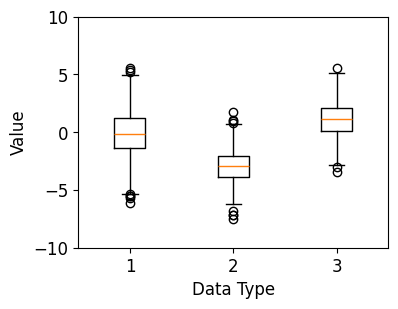
1-2. Auto ViML
Import Library
!pip install koreanize-matplotlib

import numpy as np
import pandas as pd

import matplotlib.pyplot as plt

import koreanize_matplotlib
!pip install sweetviz
!pip install --upgrade matplotlib==3.1.3
import seaborn as sns
import sweetviz as sv
df = sns.load_dataset('titanic')
df = df[['survived', 'pclass', 'sex', 'age', 'fare']]

df.head()
feature_config = sv.FeatureConfig(skip='fare', force_text=['sex', 'age'])

report = sv.analyze(df, feat_dfg=feature_config)
report.show_notebook(scale=0.7)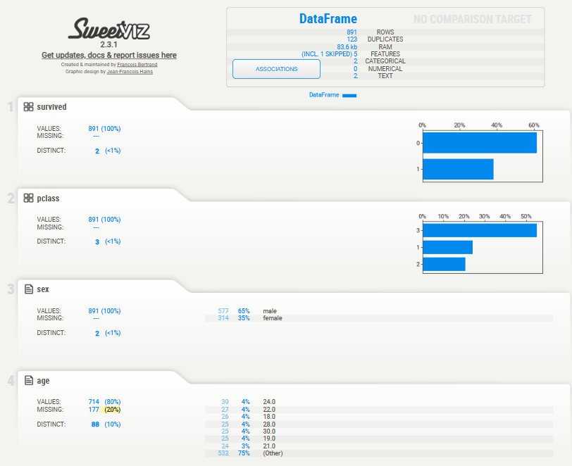
my_report = sv.compare_intra(
    df, df['sex'] == "male", ["male", "female"], "survived", feature_config
)
my_report.show_notebook(scale=0.8)
1-3. 항공사별 통계
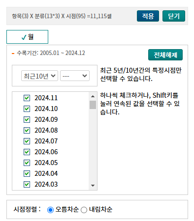
항공사별 통계 다운로드


import pandas as pd
from glob import glob

file_names = glob("*.csv")
file_names				# ['항공사별_통계_20250204143527.csv']
df_comp = pd.read_csv(file_names[0], dtype={"시점": "object"})
df_comp.info()
# <class 'pandas.core.frame.DataFrame'>
# RangeIndex: 108 entries, 0 to 107
# Data columns (total 6 columns):
#  #   Column    Non-Null Count  Dtype
# ---  ------    --------------  -----
#  0   시점        108 non-null    object
#  1   항공사별(1)   108 non-null    object
#  2   도착출발별(1)  108 non-null    object
#  3   운항 (편)    108 non-null    int64
#  4   여객 (명)    108 non-null    int64
#  5   화물 (톤)    108 non-null    int64
# dtypes: float64(1), int64(3), object(2)
# memory usage: 5.2+ KB
df_comp.head()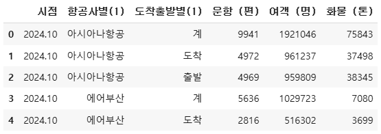
데이터 분석
!pip install koreanize-matplotlib
import matplotlib.pyplot as plt
import koreanize_matplotlib
df_comp_sum = df_comp[df_comp['도착출발별(1)]' == '계']
df_comp_arrive = df_comp[df_comp['도착출발별(1)]' == '도착']
df_comp_depart = df_comp[df_comp['도착출발별(1)]' == '출발']

df_comp_sum.shape			# (1044, 6)
df_comp_arrive.shape			# (1044, 6)
df_comp_depart.shape			# (1044, 6)
항공사별로 연간 평균 여객 수 계산
average_passengers_by_airline = df_comp_sum.groupby("항공사별(1)")["여객 (명)"].mean()

plt.figure(figsize=(12, 3))
average_passengers_by_airline.plot(kind="bar", color="skyblue")
plt.title("항공사별 연간 평균 여객 수")
plt.xlabel("항공사")
plt.ylabel("평균 여객 수")
plt.xticks(rotation=45)
plt.show()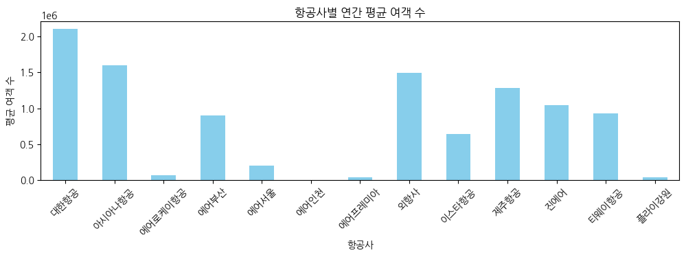
연간 운항 및 여객 증가율 계산
df_comp_sum["운항 (편)_증가율"] = df_comp_sum.groupby("항공사별(1)")["운항 (편)"].pct_change() * 100
df_comp_sum["여객 (명)_증가율"] = df_comp_sum.groupby("항공사별(1)")["여객 (명)"].pct_change() * 100

df_comp_sum.head()
df_comp_sum.tail()
도착/출발별로 연간 운항 및 여객 분석
arrival_stats = df_comp_arrive.groupby("시점")[["운항 (편)", "여객 (명)"]].sum()

arrival_stats.head()
departure_stats = df_comp_depart.groupby("시점")[["운항 (편)", "여객 (명)"]].sum()

departure_stats.plot(secondary_y="여객 (명)")
시간에 따른 화물 운송량 시각화
df_comp_sum["시점"] = pd.to_datetime(df_comp_sum["시점"])
df_comp_sum["년"] = df_comp_sum["시점"].dt.year
df_comp_sum["월"] = df_comp_sum["시점"].dt.month

df_comp_sum.head()
df_comp_sum.tail()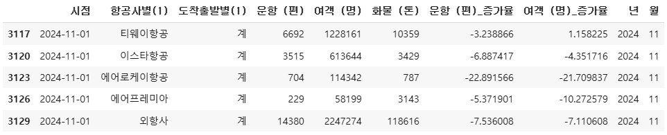
plt.figure(figsize=(12, 6))

plt.plot(df_comp_sum[df_comp_sum["항공사별(1)"] == "아시아나항공"]["년"],
         df_comp_sum[df_comp_sum["항공사별(1)"] == "아시아나항공"]["화물 (톤)"],
         label="아시아나항공")

plt.plot(df_comp_sum[df_comp_sum["항공사별(1)"] == "대한항공"]["년"],
         df_comp_sum[df_comp_sum["항공사별(1)"] == "대한항공"]["화물 (톤)"],
         label="대한항공")

plt.xlabel("년도")
plt.ylabel("화물 운송량 (톤)")
plt.legend()
plt.title("시간에 따른 화물 운송량 추이")

plt.show()
연도별 데이터 시각화
year_comp = pd.crosstab(index=df_comp_sum["년"],
            columns=df_comp_sum["항공사별(1)"],
            values=df_comp_sum["여객 (명)"],
            aggfunc="sum").fillna(0)

year_comp.style.background_gradient(axis=None).format("{:,.0f}")
year_comp[['제주항공', '진에어', '에어부산', '이스타항공', '티웨이항공',
           '에어인천', '에어서울', '플라이강원', '에어로케이항공']].plot(
               figsize=(12, 3),title="저가항공 연도별 여객 수")
year_comp = pd.crosstab(index=df_comp_sum["년"],
            columns=df_comp_sum["항공사별(1)"],
            values=df_comp_sum["운항 (편)"],
            aggfunc="sum").fillna(0)

year_comp.style.background_gradient(axis=None, cmap="Greens").format("{:,.0f}")
year_comp[['제주항공', '진에어', '에어부산', '이스타항공', '티웨이항공',
           '에어인천', '에어서울', '플라이강원', '에어로케이항공']].plot(
               figsize=(12, 3), title="저가항공 연도별 운항 수")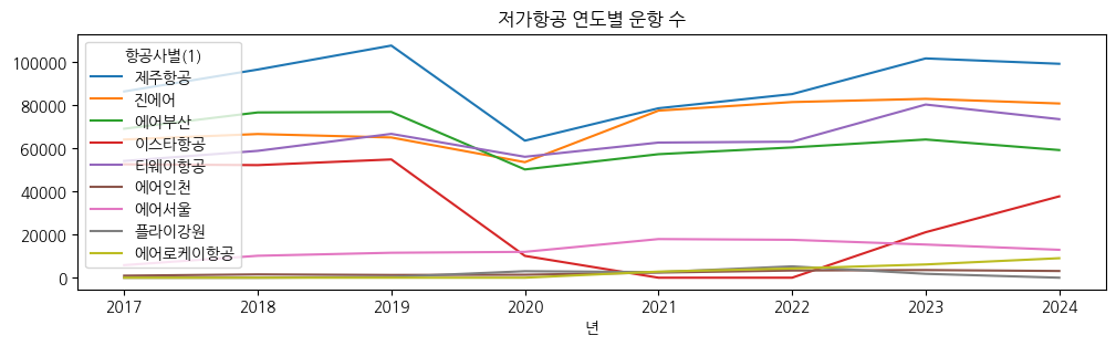
year_comp = pd.crosstab(index=df_comp_sum["년"],
            columns=df_comp_sum["항공사별(1)"],
            values=df_comp_sum["화물 (톤)"],
            aggfunc="sum").fillna(0)

year_comp.style.background_gradient(axis=None, cmap="Oranges").format("{:,.0f}")
year_comp[['제주항공', '진에어', '에어부산', '이스타항공', '티웨이항공',
           '에어인천', '에어서울', '플라이강원', '에어로케이항공']].plot(
               figsize=(12, 3), title="저가항공 연도별 화물(톤) 수")
'SK네트웍스 Family AI캠프 10기 > Daily 회고' 카테고리의 다른 글
| 19일차. Machine Learning & Data Preprocessing (0) | 2025.02.07 |
|---|---|
| 18일차. Data Visualization(Seaborn) & Data Cleaning (0) | 2025.02.05 |
| 16일차. Pandas & Data Visualization (0) | 2025.02.03 |
| 15일차. 데이터 분석 & Pandas (1) | 2025.01.31 |
| 13-14일차. 단위 프로젝트(프로그래밍과 데이터 기초) (0) | 2025.01.24 |


